Catching Fire – on Fire!
I wanted to say Catching Fire Catches Fire. But Publisher’s Weekly already said that…
At BEA Friday, the ARCs were hard to come by, but I was lucky. I’m taking a break at the moment, a third of the way through this book which has, so far proved worth the buzz… YES, you gotta read this! (Yesterday!)
My purpose here, however, is to talk about the covers, not what’s between the them.


I loved the cover of Suzanne Collins‘ The Hunger Games (Scholastic 2008). It isn’t drastically different from the crowd, but it embraces a few of the conventions I’ve noted. Most particularly what I pointed out a couple of months ago in my post about what Liza Gilbert’s teens liked. “A real focal object, and a mysterious atmospheric quality. Mostly good type treatment… Good hooks.”
The Hunger Games: Focal object? CHECK. Mysterious atmospheric quality? You could say that. CHECK. Type treatment? Yeah – looks very futuristic. Probably a good hook. CHECK.
The way I interpret book #1’s jacket, which is to say, I think it fits the story (another CHECK), is this: There’s darkness in the land. Each circle marks one of the 12 districts (here linked, but with walls? blocking the links?). And there’s hope. A golden mockingjay pin marks the spot.
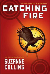
And here’s Catching Fire (Scholastic, 9/2009). Some brightness radiating out, with more light coming from District 12. No walls. The arrow has disappeared. Does that mean something?
And… what’s that? The mockingjay has come alive! Here’s another assessment of the symbols.
I love this cover, and I hope Scholastic sticks with this for the paperbacks (I beg you, Scholastic, do not put people on the paperback issues). I strongly dislike the UK (Australian?) Hunger Games cover. I’m not at all convinced that making the book look like 90% of the other books out there will hook readers. Here’s hoping that they stick with BUZZ and a great matching cover for the third book.
If you’re not as convinced as I am that this was a good choice, what do you think of the UK cover of Catching Fire? And do they really need Stephenie Meyer‘s name to boost sales? (Caveat: Amazon UK shows the U.S. cover so I’m not sure this is what they’re really releasing?).
Don’t miss this article at Publisher’s Weekly that flashes Hunger Games book jackets from around the globe.
Hunger Games: In a future North America, where the rulers of Panem maintain control through an annual televised survival competition pitting young people from each of the twelve districts against one another, sixteen-year-old Katniss’s skills are put to the test when she voluntarily takes her younger sister’s place. (CIP) Ages 12+. Reviews: 1, 2, 3, 4, 5. Trailer. Videos of Collins talking about the Hunger Games.
Catching Fire: By winning the annual Hunger Games, District 12 tributes Katniss Everdeen and Peeta Mellark have secured a life of safety and plenty for themselves and their families, but because they won by defying the rules, they unwittingly become the faces of an impending rebellion. (CIP) Ages 12+. Reviews: 1, 2.
June 1, 2009 at 1:48 am
Just wanted to thank you for linking to my review, and let you know I’m already half way through Catching Fire. I’m thrilled that it’s completely living up to my extremely high expectations! I thought The Hunger Games was great, and I was worried I was setting my expectations too high, but unless the author completely blows the second half of the book, then I’ll like it as much if not more than The Hunger Games.
June 1, 2009 at 2:46 am
I liked your opening line – “Every once in a while there’s a book that just WHAM! takes over your life.” It’s what happened to me with Hunger Games, too – something I hadn’t expected it to do.
June 1, 2009 at 2:47 am
Oh, and I finished Catching Fire and can’t WAIT until the next one. Oh… but I have to :-(
June 1, 2009 at 1:55 pm
I have to say, I haven’t read Catching Fire, yet…but will soon! Hooray. The first book, The Hunger Games, was in my opinion the best YA book of 2008. Anyway, on to the covers…
I checked out the links to the foreign covers and I wholeheartedly agree that having Kat appear on the cover is not a good choice. It just feels wrong, somehow. She’s either not what I pictured or maybe because some parts were so rough, I didn’t really even want to have a firm visualization in my head of what the character looked like…I don’t know. Stylistically, I feel the US covers are much stronger, but surprisingly enough, I have to work really hard at booktalking The Hunger Games at our Library. The teens seem to glaze right past the cover on the shelf.
July 3, 2009 at 12:08 pm
Thanks for the links! I love seeing foreign editions (even when they are fugly). ;)
July 22, 2009 at 1:01 pm
The Aussie book cover is indeed atrocious. I think the UK version of Catching Fire is a bit better, but the US covers are much much better. I find these kind of covers are easier to sell to boys. If a girl is on the cover…forget it.
August 18, 2009 at 8:29 pm
I have the Australian cover of The Hunger Games, and I think it’s awful. I bought it based on reviews, but I would never have picked it up otherwise. It’s so hard to recommend because everyone is put off by the cover, and most of my friends have ordered a US copy of Catching Fire because ours are so bad.
November 21, 2009 at 3:23 pm
I LOVE THE HUNGER GAMES